
British Airways
Background

Background
During my time at TESCO I spent 6 months in the centralised design system team. This included the Clubcard app, self checkout machines and their b2b Enterprise tools. Along with 2 other DS designers we picked up tickets raised by product and UI designers to review and accept new components into Design System. We also ensured regular maintenance of documents and best practises when it came to accessibility and usability.
The process in place
Pick up the next ticket in line - this have been pre ordered by importance/urgency
Understand if the ticket is from a designer or a business need
Go through the ticket and raise any Qs from creator
Are any other designers facing the same design challenge? And if so lets get together and see if this component/change can be done as one to reduce repetition and size of design system
Either push back or accept the change/new component and update the relevant documents
Setting up the Enterprise rules
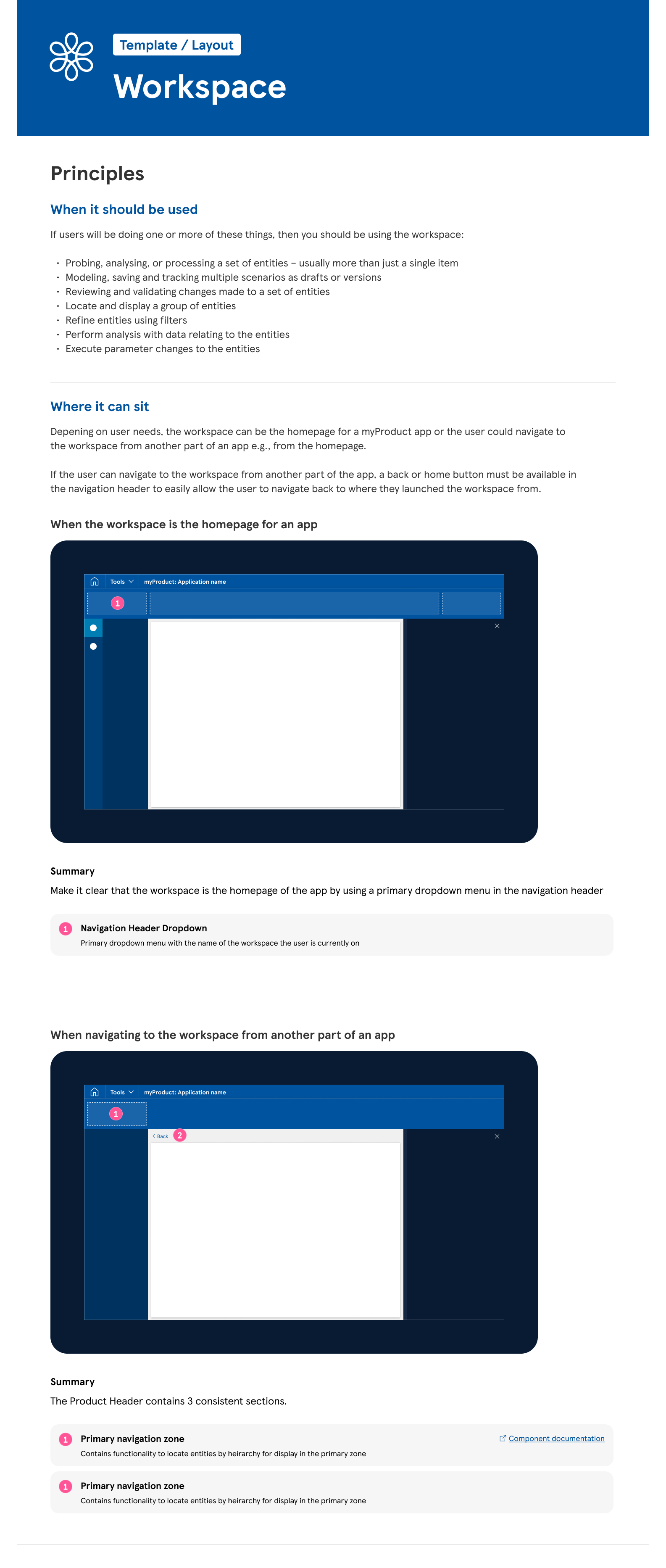
As I joined the Design system team it was an exciting time. The b2b Enterprise tools that deal with big data such as promotions, prices, product were about to go through a major overhaul in both UX and UI. I was tasked with writing up the rules and documentation that spanned the 9 products in this product space.
My first challenge was to write the rules surrounding the workspace. To do this, I sat down with each of the design leads and mapped out the current structure of the dashboard in each of the products. We discuss commonalities and what were essentials to have. After a 2 day workshop I got my answers and drew up the documentation to sit within the design system. This was then passed around the verticals and leads for review.
I made sure the documentation was clear, outlined principles, usage and examples.
When writing up the documentation I had to make sure every angle was covered, so the the workspace was used properly and there was a seamless transition between products. It also meant that questions were kept to a minimum and more time could be spent on timing.
Templates and Layouts
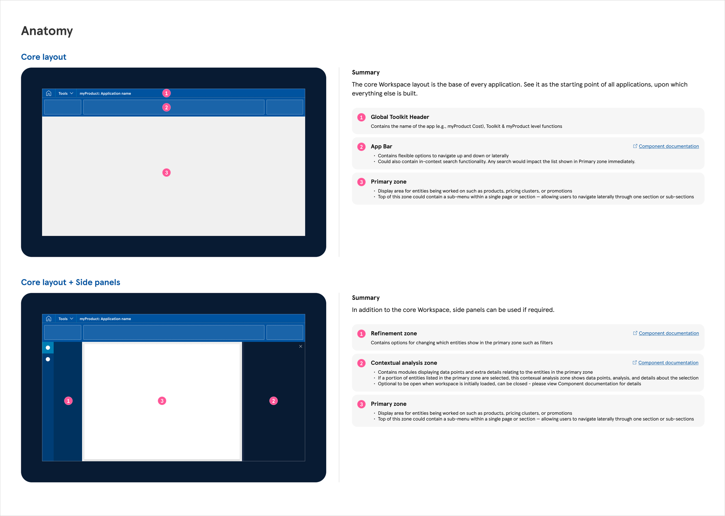
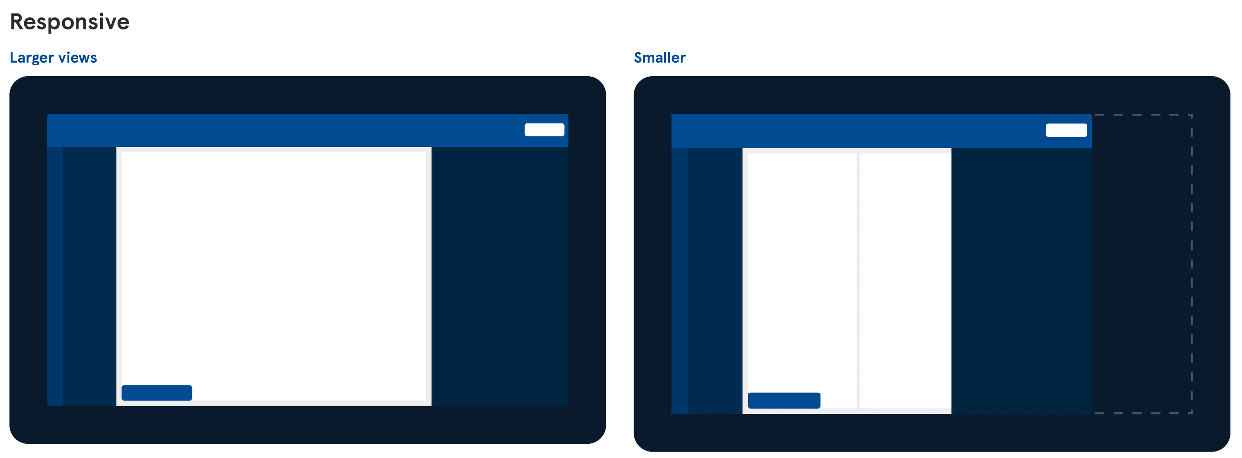
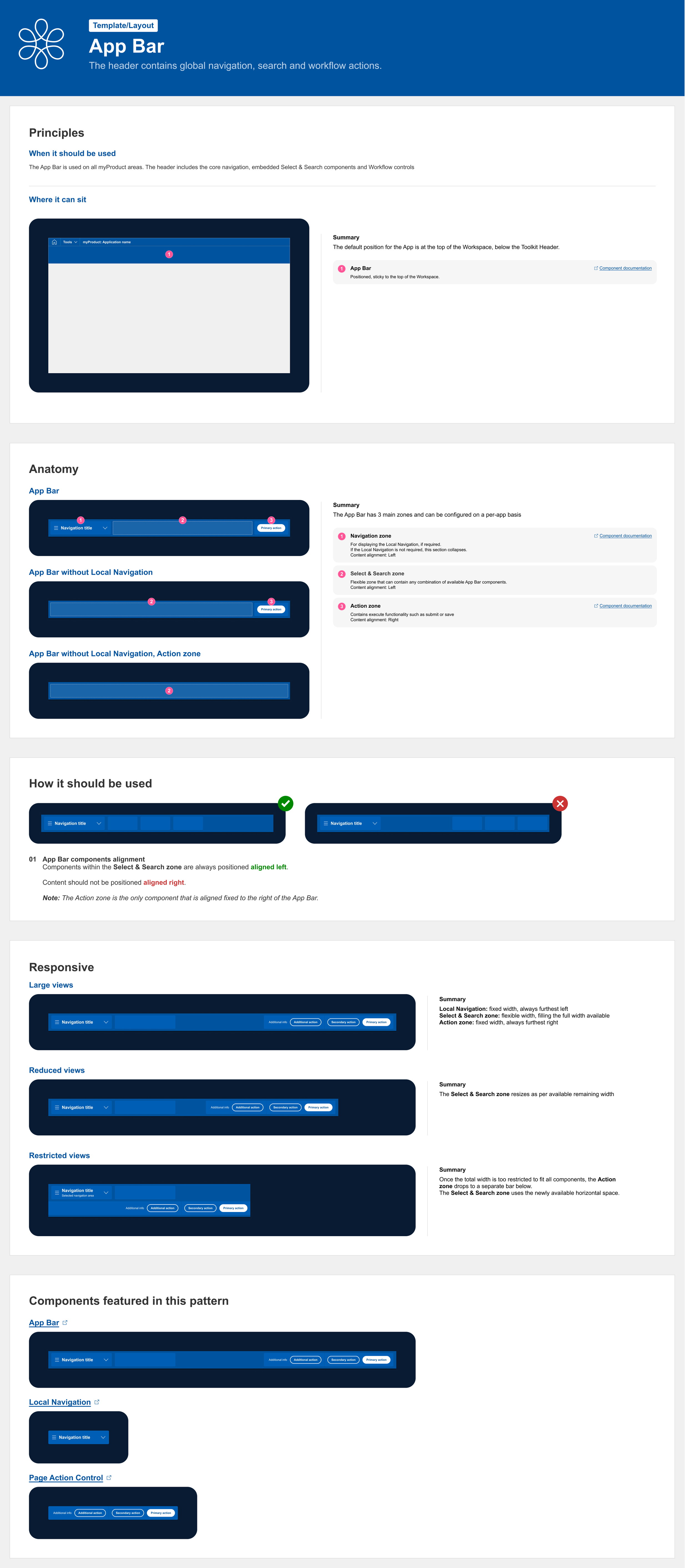
The next level down in terms of hierarchy was to tackle was templates and layouts. A workspace would be made up of these components. This would include app bar, main workspace, side bar (left and right). The documentation followed the same structure for consistency and the process was exactly the same with speaking to designers, product manages and devs to understand how they components would function, look and behave. In the example below you can see the documentation for the App Bar.
Data Visualisation
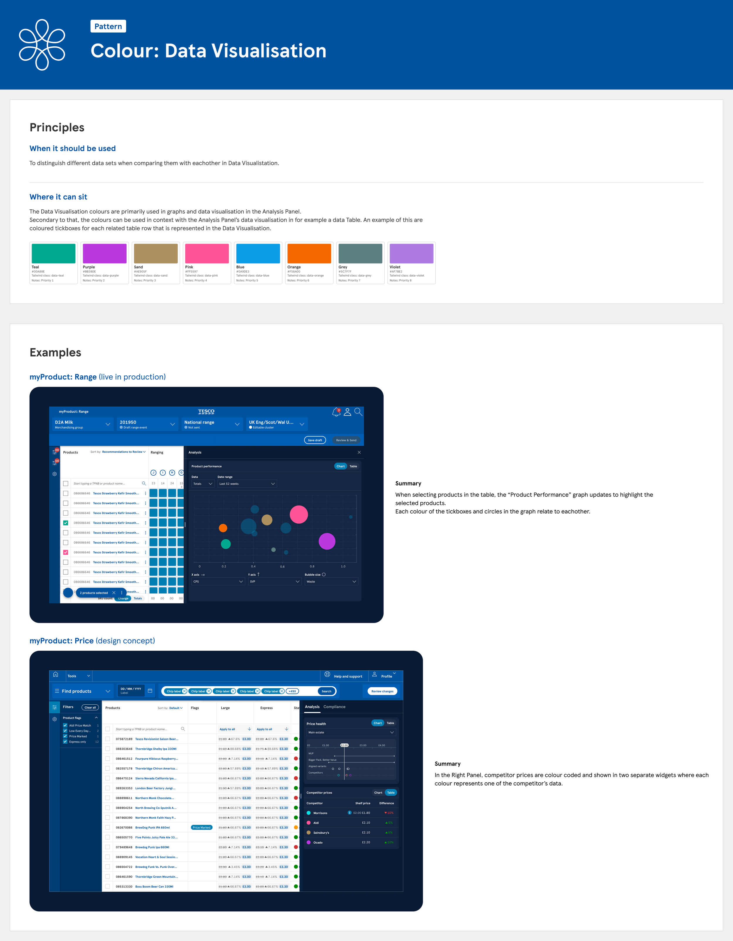
One of the more challenging tickets that came in was the colour order within charts and graphs. Even though TESCO had established primary blues, background greys and traffic light colours for function there wasn’t any data vis colours to signify different values or points.
My starting point was to speak to all the teams and understand the maximum amount of points there could be and this turned out to be 8 with the average of 5. From here I went round the colour wheel and picked contrasting colours so those with mild colour blindness could still pick out the 8 different colours. As this product was only used internally and not consumer facing we didn’t have to nail the AA standard as we wanted the colours to work on both a light and dark background.
After 2 weeks of meetings with designers and devs, the 8 colour points were concluded and I added this to the Design system
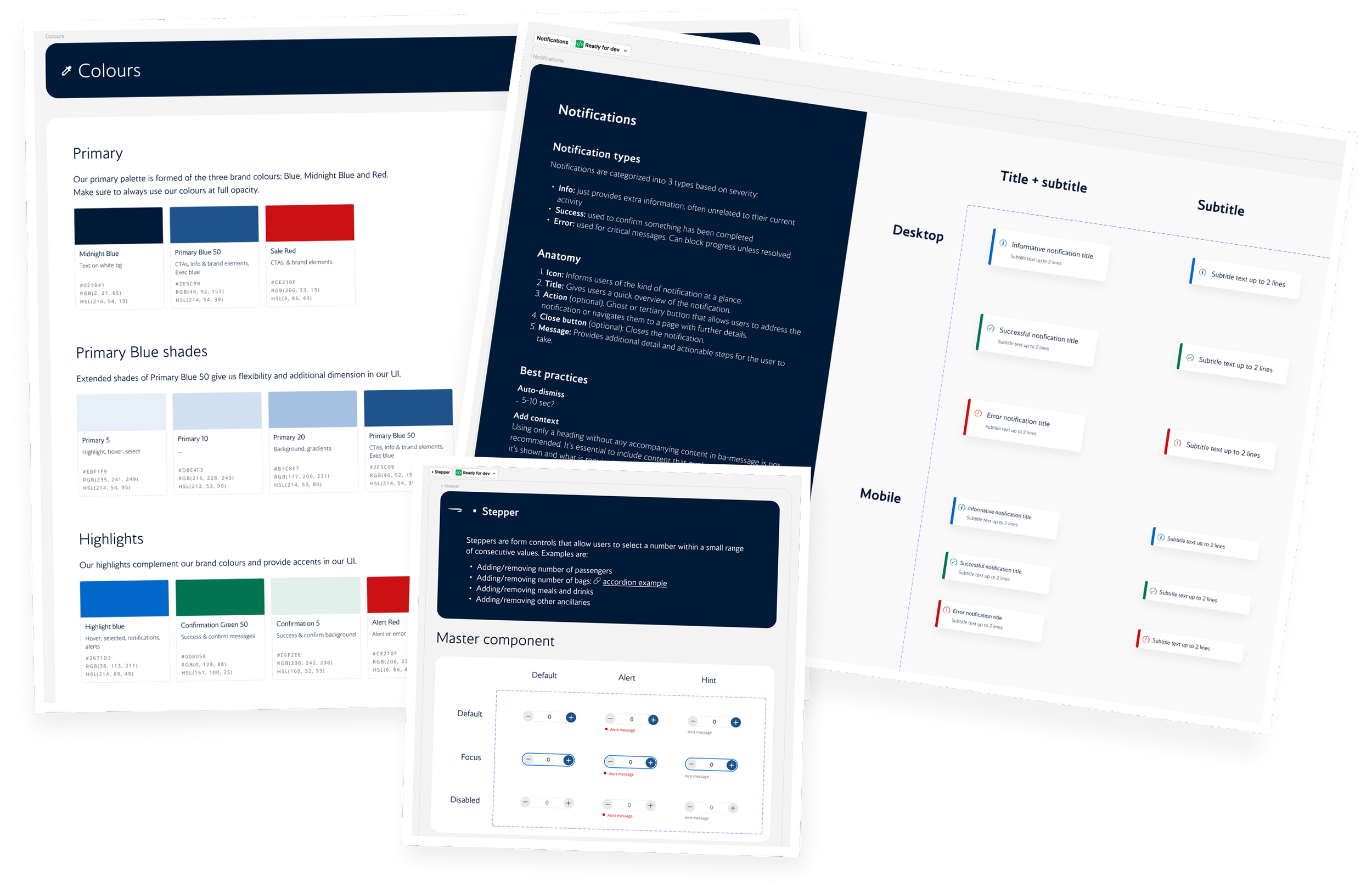
During my time at British Airways each of the 4 verticals contributed to the design system. The leads of each of these verticals would meet weekly to discuss new components and maintenance of the design system.
We shared the atom elements such as BA colours, buttons, spacing etc but had different components such as fare cards, location selection and frequent flyer cards for example.
The fare card complexity
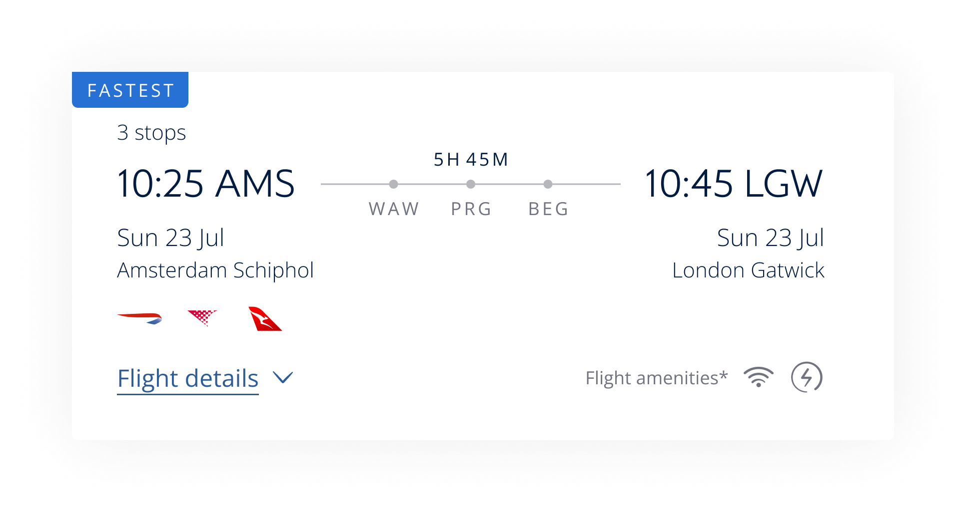
One of the biggest challenges I faced was the complexity of the fare cards. They house lots of information, some letters, numbers, icons/logos and shapes. A single card can have 14 variables, with each of these having multiple options. During the booking journey these change due to the users needs; one may show the cost of the fare and a detailed breakdown of the fare option. The other may not show this info but the connecting flights and their flight times.
Below you can see the where the fare cards are presented across the booking journey (mobile).
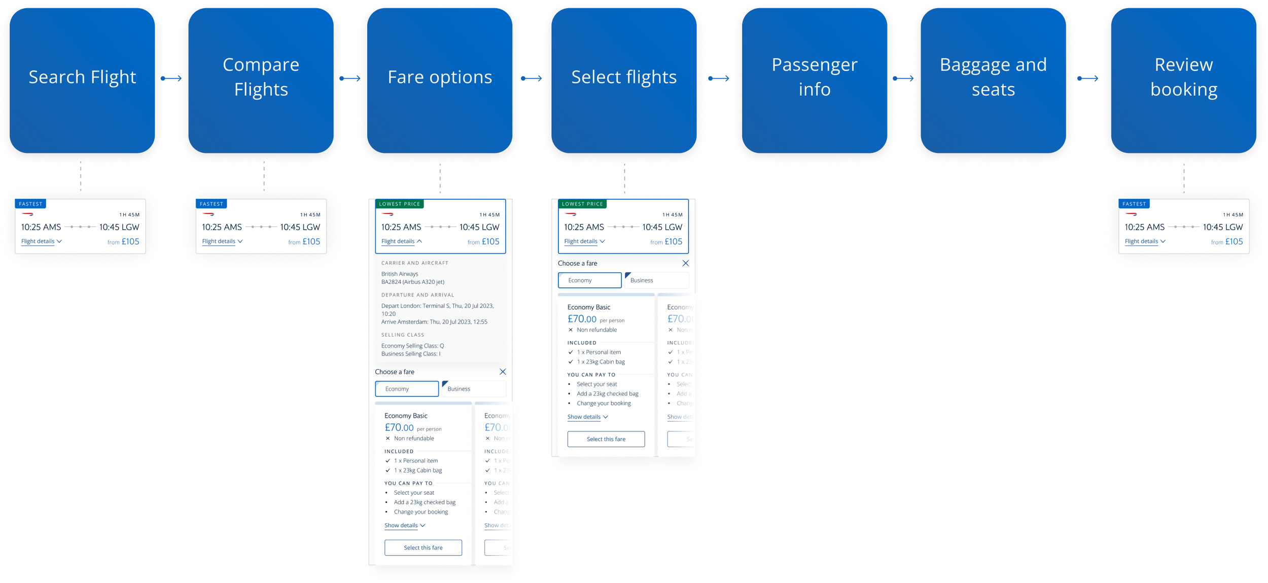
Searching & comparing flights
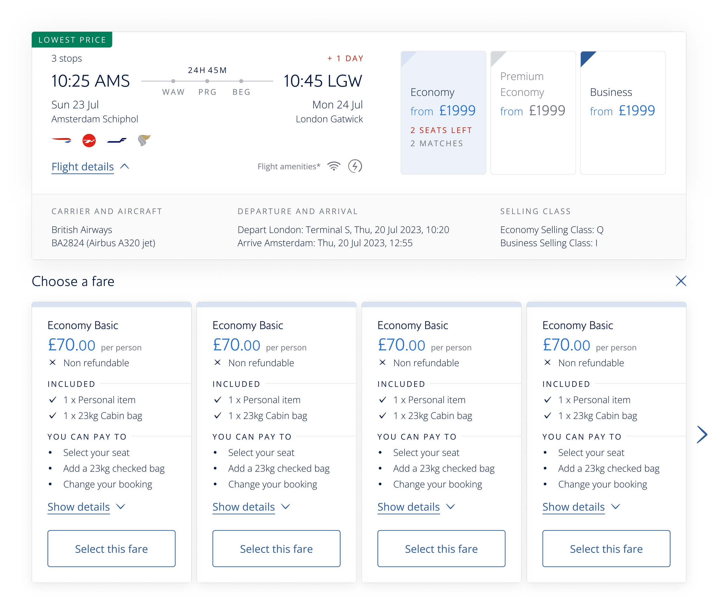
Flight Selected; fare options presented
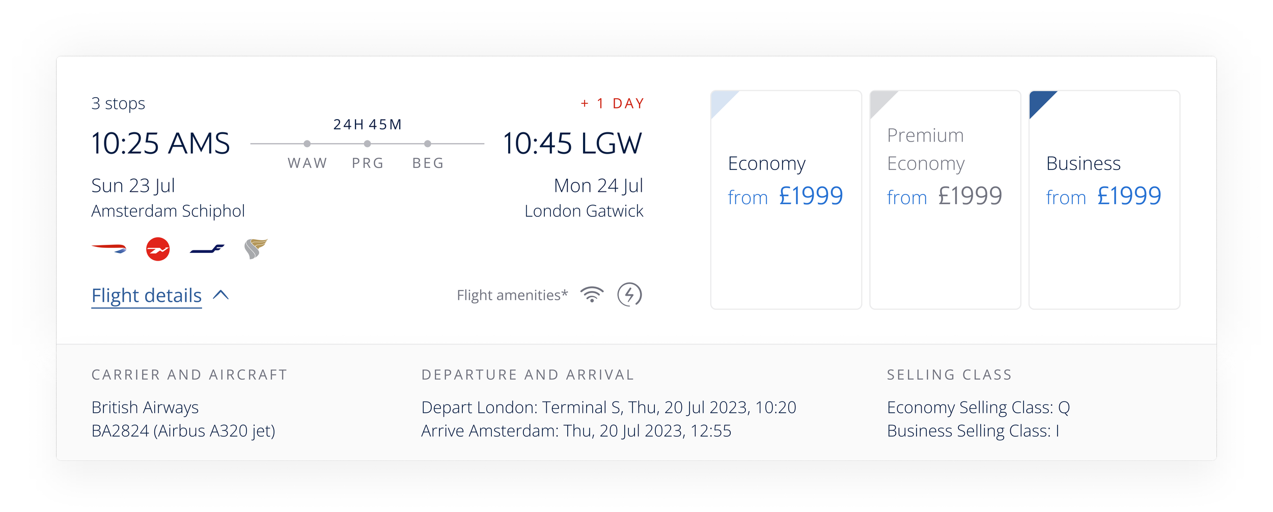
At this stage the card was kept small and compact as up to 7/8 cards could be shown on the screen at one time.
We showed the most minimal amount of information that the user would need to progress. We focused on things such as flight time, flight lengths and connections.
During this stage the user knew what flight they were going to take. We kept in the basics but started to show the prices of the different fares and airplane details.
This was important to make sure their expectations were met in terms of price and fares available and to affirm they had the right flight selected.
Fare option selection
Now the user has built up the familiarity with the fare card and its complexity, we can introduce interactivity. When the user selects economy within the fight card, all the sub options within economy display below. Thus acts as a carousel and the user can browse at their leisure without leaving the page or losing any of the flight details.
Below you can see a video of all the variables of the flight cards in Figma and the properties behind them.
At the end of the video you can see the building blocks of elements to build out the flight card.